


When presenting to clients, you want your ideas not only heard, but believed and embraced. The single best way to impress clients is by using data and metrics to reinforce your key insights and recommendations. Data and metrics add legitimacy to your message and prove that you have done the research necessary to justify what you are talking about. Too often, individuals fall into the trap of presenting boring, confusing, or data-thin graphics that cause clients to be apprehensive or suspicious of what you are telling them. Luckily, there are several key considerations you can make when creating your graphics.
The Purpose of Information Design
First, let’s discuss the purpose and importance of information design when creating graphics. Humans have the innate ability to synthesize visual information. Visual displays and graphics cater to this ability and can be vital instruments to help people reason through quantitative information. When graphics are done well, they cause the viewer to see both the broad macro-view of the trends as well as the fine micro-view of the data. These graphics can convey quantitative depth and statistical integrity but also encourage action.
Key Considerations When Creating a Graphic
Begin with the Source Data
Before you begin creating your graphics, evaluate the density and richness of the source data that you have. The density is the overall amount of entries you have in your data matrix. Typically, the more entries you have, the more accurate insights you can identify. The richness of your data is defined by the number of variables for each data point or the number of dimensions that those data points have.
For instance, let’s say you are looking at the demographic data of your users. The number of users you are evaluating shows the density of your data, and the factors like the age, sex, race, and income level of each user would point to the richness of your data.
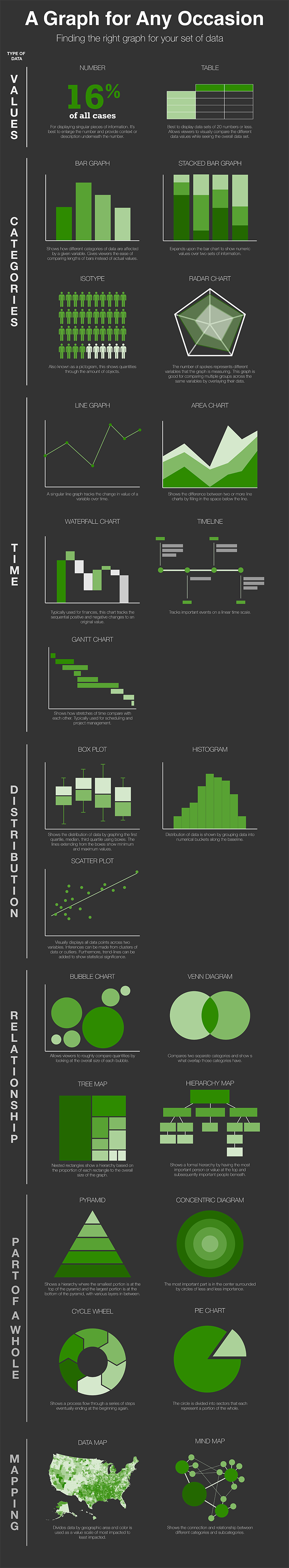
Determine the Appropriate Type of Graphic
After you have an understanding of your source data you can determine the type of graphic that is best suited for your data set. Here are the six most common types of graphics that can be used. Many of the common graph styles you’ve seen fall inside these six groups.
Values – Showing the data itself through key statistics or values on a table.
Categories – Compares different groups or categories of data across one or multiple variables.
Time – Shows the changes your data makes over a given time period.
Distribution – Evaluates trends in data by looking at the spread of the data or the outliers.
Relationship – Visually compares data by incorporating hierarchy
Part of a whole – Shows how all the data fits together into one complete picture or process.
Mapping – Expresses data and categories based on physical space or geographic area.
For an infographic on the specific types of graphs and when to use them, click here.
Focus on Attributes of Appearance
Once the type of graphic is established, the physical appearance of the graph can be improved by focusing on data-ink, incorporating layers and separation, and using color.
Data-ink is the proportion of a graphic’s ink devoted to the non-redundant display of information, popularized by the information designer Edward Tufte. In layman’s terms, Tufte wants you to make sure you don’t have unnecessary elements or wasted “ink” in your graphics (For the technical definition of data-ink you can read his explanation here. The simplest ways to maximize your data-ink proportion are to remove unnecessary gridlines and labels and to choose graph types that do not waste space such as bar graphs and box and whisker plots. If you are having trouble with this concept, break down the graph into its various parts to determine what is necessary and what can be removed.
Next, focus on ways you can incorporate layers and separation into your data. You can delineate visual levels of your graph through the use of value, texture, color, and shape. For example, a lot of technical graphs and schematics have annotations, which are often in a different color than the rest of the graph. You can also create separation and emphasize important data by moving it to the top of your chart.
Finally, focus on incorporating color to enhance the appearance of your graph. Color can be used in four main ways: 1) to label or differentiate different variables, 2) as a unit of measurement, 3) to imitate or represent reality, or 4) to enliven or decorate. When using color make sure to use bold/bright colors sparingly with gray or muted backgrounds. Often time natural colors are more acceptable and pleasing to the eye than other colors.
Avoid Common Pitfalls
Unfortunately, many people don’t trust statistical graphs because they have been misled by them before. Some designers feel the need to cherry pick data points to make their insights more pronounced. A rule of thumb from Edward Tufte is that “if your numbers are boring, you have the wrong numbers”. Graphs can also be manipulated by altering or creating inconsistent units on the x and y-axis. Most people may not pay attention to the units, but if they notice the discrepancy, they will lose trust in your information.
Computers have made the creation of graphs as easy as clicking a few buttons. However, this ease of use has also led to the creation of many poor visuals. The first thing to avoid with computer-created graphs is patterns. Too many patterns used in a graph often create confusion and detract from the information being presented. The second thing to avoid is 3-D graphs. 3-D graphs have become commonplace, however they should only be used when evaluating data with three different variables. Things like 3-D bar graphs are unnecessary because they detract from the information being presented and increase the amount of data-ink used.
Using data and metrics when presenting to clients adds substance and purpose to what you are telling them. By adopting principles of information design, you can communicate data and metrics with compelling tables, charts, and graphs. True graphical excellence will allow your complex ideas to be communicated with clarity, precision, and efficiency.
To learn more about how to apply information design principles to improve your executive presentations, please read our companion blog post here.
References:
Envisioning Information by Edward Tufte
The Visual Display of Quantitative Information by Edward Tufte
About Weber Associates
Weber Associates is a Columbus, OH-based consulting firm. Since 1985, we have blended the creativity of a marketing agency with the analytical rigor of a consultancy to help our clients solve real sales and marketing challenges so they can significantly grow revenues and customer loyalty.
